Blue Rent Website
FULL APP DESIGN


UX RESEARCH
Understand user needs and define the project goals.
Design
Develop high-fidelity designs, focusing on usability and aesthetics.
Test & Refine
Conduct usability testing to identify and solve potential pain points.
Valuable Feedback
To see how well the design worked in a real-world setting, I ran usability tests with a group of family members aged 21 to 60, all moderately tech-savvy.
The goal was straightforward: ask them to complete five key tasks, rate the difficulty, and observe how naturally they navigated the app. This gave me valuable feedback on where the designs still needed improvement.
Improvements Made
All tasks were completed successfully, and most users were able to navigate the app with minimal guidance. However, there also was definitely room for improvement. Based on the feedback, I updated the following areas:
Clearer wording and additional context for insights
Added optional information to each 'my car' statistic
Made helpful features, such as articles, stand out more
The Challenge
As the adoption of electric vehicles increases, drivers often have trouble locating the best available charging stations. There are some apps available, but they come with limited features.
The solution
VoltFinder helps EV drivers find nearby charging stations, and provides users will everything they need: from real-time availability to smart route planning, and sustainability insights.
Conducting online surveys
After the interviews, I created an online survey and shared it via social media and in EV communities.
The survey included multiple-choice questions such as: "What’s your biggest frustration when finding a station?" and "How often is a charger status inaccurate?"
The results confirmed the interview insights, but also revealed new pain points. Giving me a clear view where current apps fall short and what to focus on.

Visiting a local charging station for interviews
To learn more about EV drivers and their challenges, I conducted user interviews at a highway charging station. I asked participants 8 questions about their issues with apps, and about what matters most when choosing a spot.
The data gathered shaped the app's features. Some important conclusions: users want charging spots along their route, with fast charging, and real-time availability. A major pain point was inaccurate availability.
UX Research: From First Draft to Gameplan
UX RESEARCH

Understand user needs and define the project goals.
ANALYZE
Brainstorm ideas and explore multiple design directions.
Design
Develop high-fidelity designs, focusing on usability and aesthetics.
Test & Refine
Conduct usability testing to identify and solve potential pain points.
Role
UX research, UI Design
Project
Website Redesign
Tools
Figma, Miro, ChatGPT
Timeline
Nov - Dec 2025


Creating an App Flow
What are users looking for in a charging finder app?
My next step was to define the structure of the application by creating a site map.
By doing a tree test I found out there was too much overlap between the 'Navigate' option and the features within 'Map'. The distinction between these two functionalities was unclear, and the labels led to further confusion.
To solve this, I decided to rename the 'Navigate' option to 'Plan Route' and shift the focus for it entirely to smart route planning.

Project learnings
6
For my first end-to-end app design, I got to dive into every step: from early research to final UI. Along the way, I learned that good design isn’t just visual; it’s also about using the right words and giving users the context they need. Overall, I learned a lot and am excited for future projects!
The next steps
For future development, I recommend further user research to better understand user needs. Besides adding new features, it would be valuable to offer more customization options, letting users tailor their dashboards to the data they find most important.
43s
9
8.6
Participants tested the prototype
Average time to complete a task
Iterations made after user testing
Final user test usability rating
Analyzing: Making key Decisions with Data
After organizing the research data, I identified the three most important user needs that are missing in current solutions:
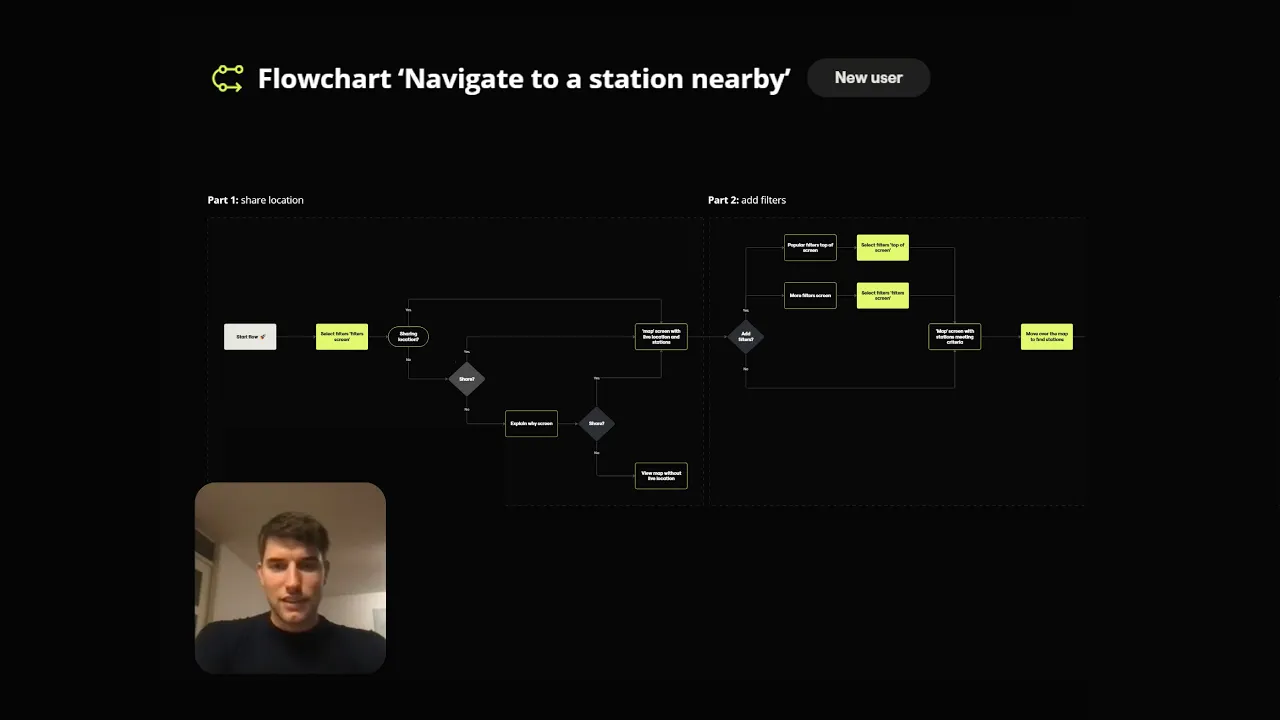
Flowchart Walktrough
After creating the sitemap, I worked on creating the flowcharts for the most important user flows.
Creating a step-by-step overview made me realize how many steps it takes to reach a single goal, and gave me the insight to make the flows as lean as possible.
In a short video, I will walk you through: “How to navigate to a nearby station (for new users)”.

reliable charger status
The charging station information is often inaccurate.

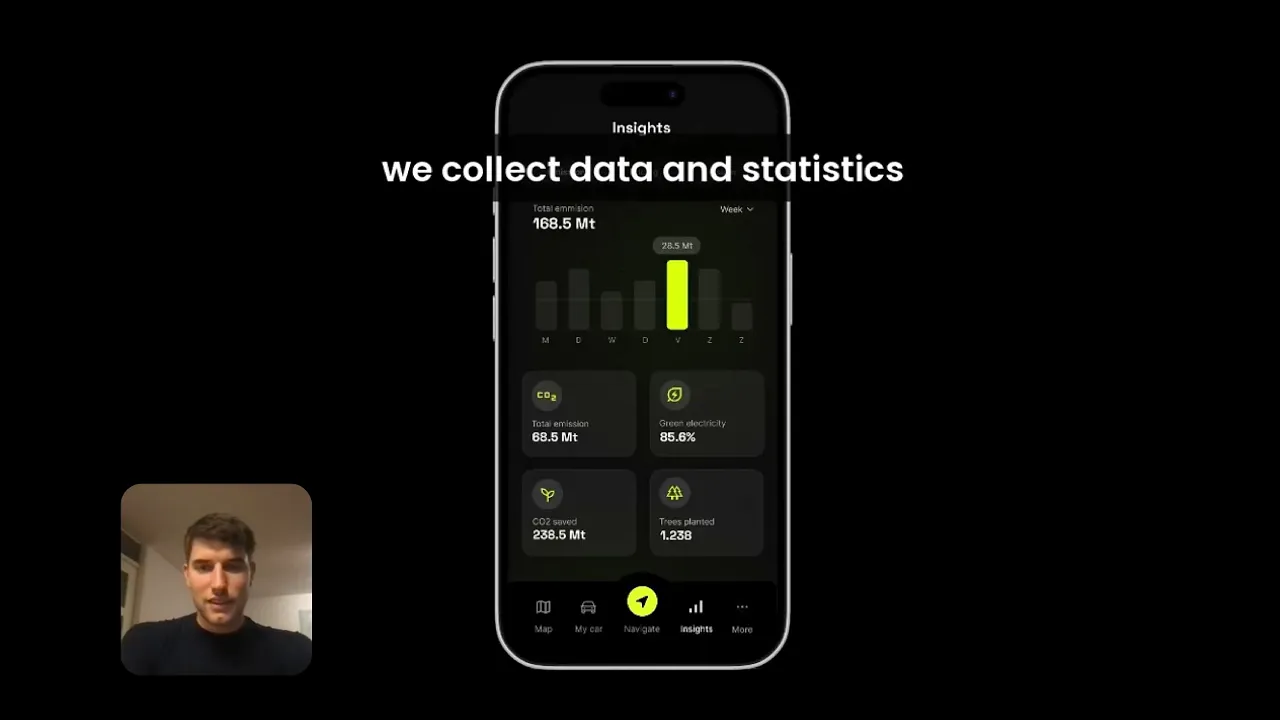
environmental insights
Most apps ignore an important factor: environmental impact.

Users want to learn
Users want tips to save money and reduce their environmental impact.
The Fun Part: Creating the app designs
Design

Develop high-fidelity designs, focusing on usability and aesthetics.
ANALYZE
Brainstorm ideas and explore multiple design directions.
Research
Understand user needs and define the project goals.
Test & Refine
Conduct usability testing to identify and solve potential pain points.

Vibrant Dark Mode Palette
I chose a dark theme with yellow accents, taking inspiration from the color of electricity to create vibrant highlights. And it wasn't just a stylistic choice; the dark-mode also helps save battery life, aligning with the values of EV drivers.


Graphite
#2C2C2D
Futuristic & Clean Typography
Space Groteskt is used for titles, Its futuristic geometric character adds personality to the layout, creating a strong visual hierarchy against the dark mode aesthetic.
Inter is used for all body copy in the interface. Its simplicity and balanced proportions guarantee high readability.
Step 4: Test & Refine
The final product
01. UX RESEARCH
Understand user needs and define the project goals.
02. ANALYZE
Brainstorm ideas and explore multiple design directions.
03. DESIGN
Develop high-fidelity designs, focusing on usability and aesthetics
Test & refine

Conduct usability testing to identify and solve potential pain points.
Neon Yellow
#DAFF00
Onyx Black
#101114
Graphite
#2C2C2D
Grey Olive
#919191
White
#FFFFFF

Design
Testing
Wireframing the App
I created a fully-functional, high-fidelity prototype of the new flows using Figma. At the same time, I started recruiting users for the test who fit the target audience.
ANALYZE

Brainstorm ideas and explore multiple design directions.